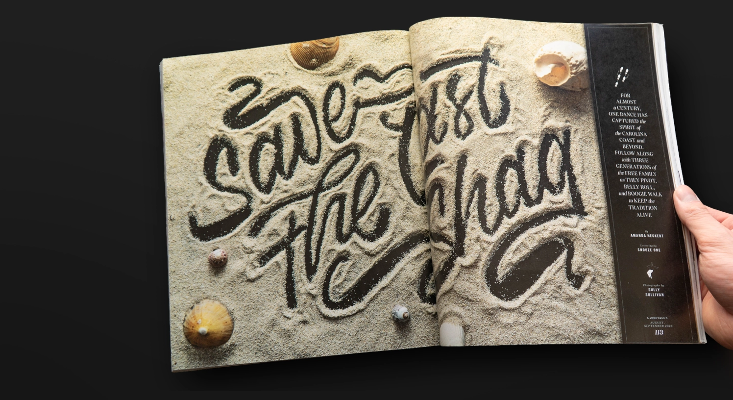
For the August/ September Issue of the Garden & Guns Magazin I was asked to create a lettering opener for an article written by Amanda Heckert, which tells the story of the Shag Dance from the Carolina Coast.
For the first round of exploration, we explored a broad range of styles that was based on references from the 1950 type design. Ranging from sign painting inspired letters to a lettering design inspired by the “The shag” Movie, plus some simple illustrations to be used for the article.
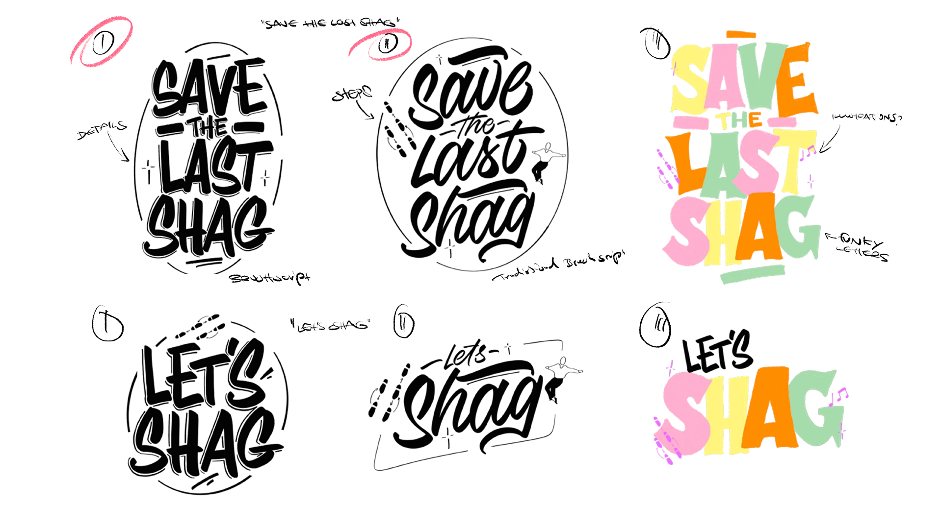

In the second round we look at these brush letters with a horizontal approach.
After going through the style explorations, the lettering should fill up a whole spread. So, I went back and finetuned the composition and came up with different concepts for the layout and color.

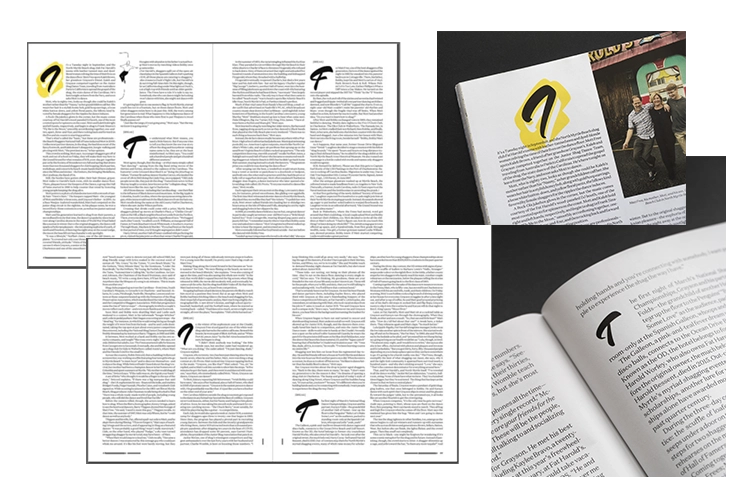
The spread is accompanied by a series of drop caps featured in the article following a similar style.
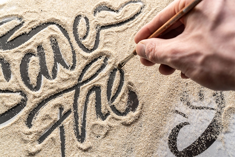
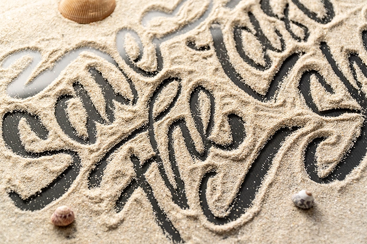
Since this dance was born from beach culture we wanted to communicate that through the lettering and bring more dimension into it. We landed on using sand as a medium.

